Farm Aid Brand & Editorial System
Optimizing information hierarchy within strict technical and physical constraints.
Overview
The Goal: Redesign the identity and a multi-page newsletter for Farm Aid to improve readability and brand trust.
Role: Lead Designer (BFA Graphic Design)
Timeline: April 2015
Tools: Adobe Illustrator, InDesign, DSLR Photography, Manual Bookbinding.
1. The Problem: Navigating Content Complexity
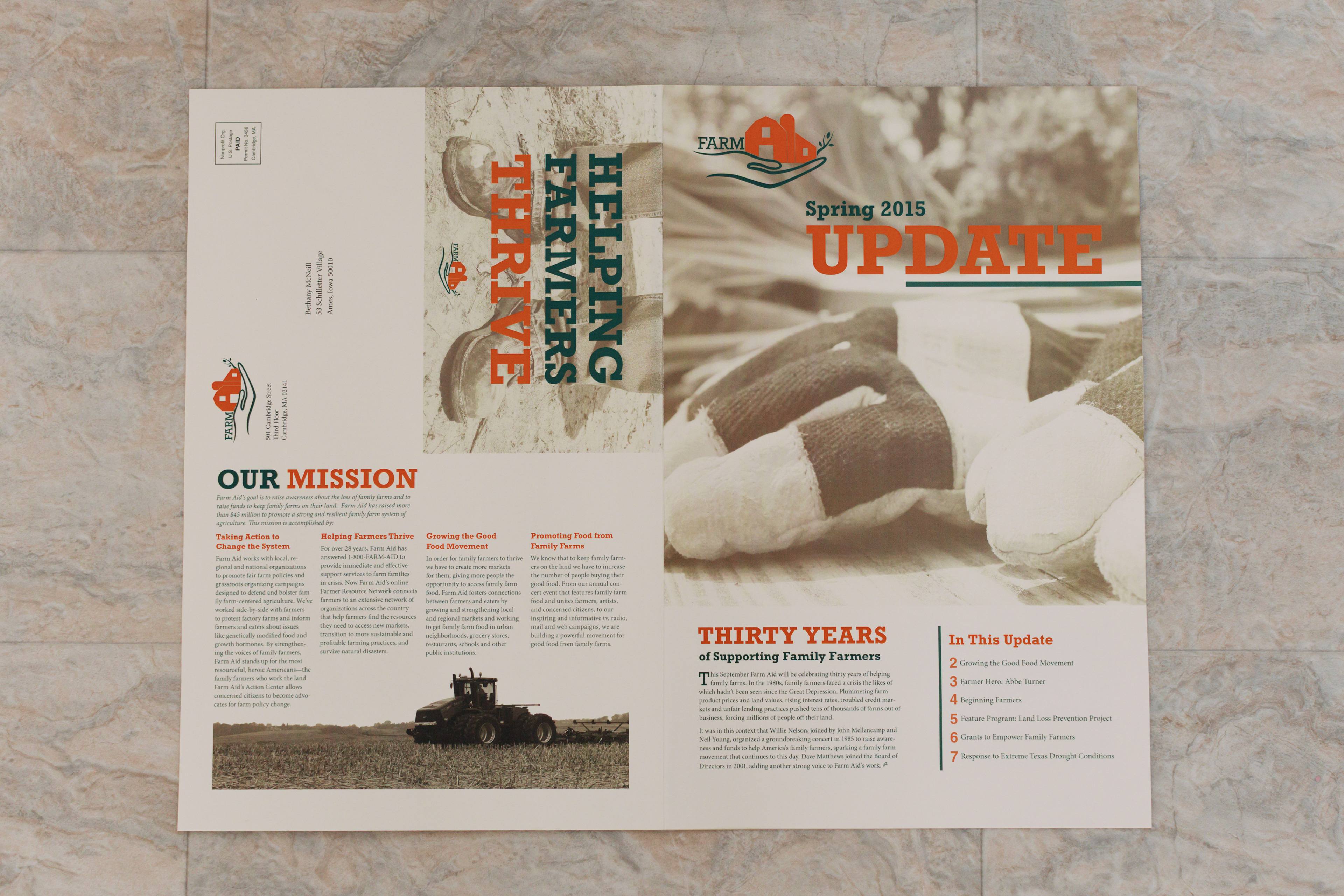
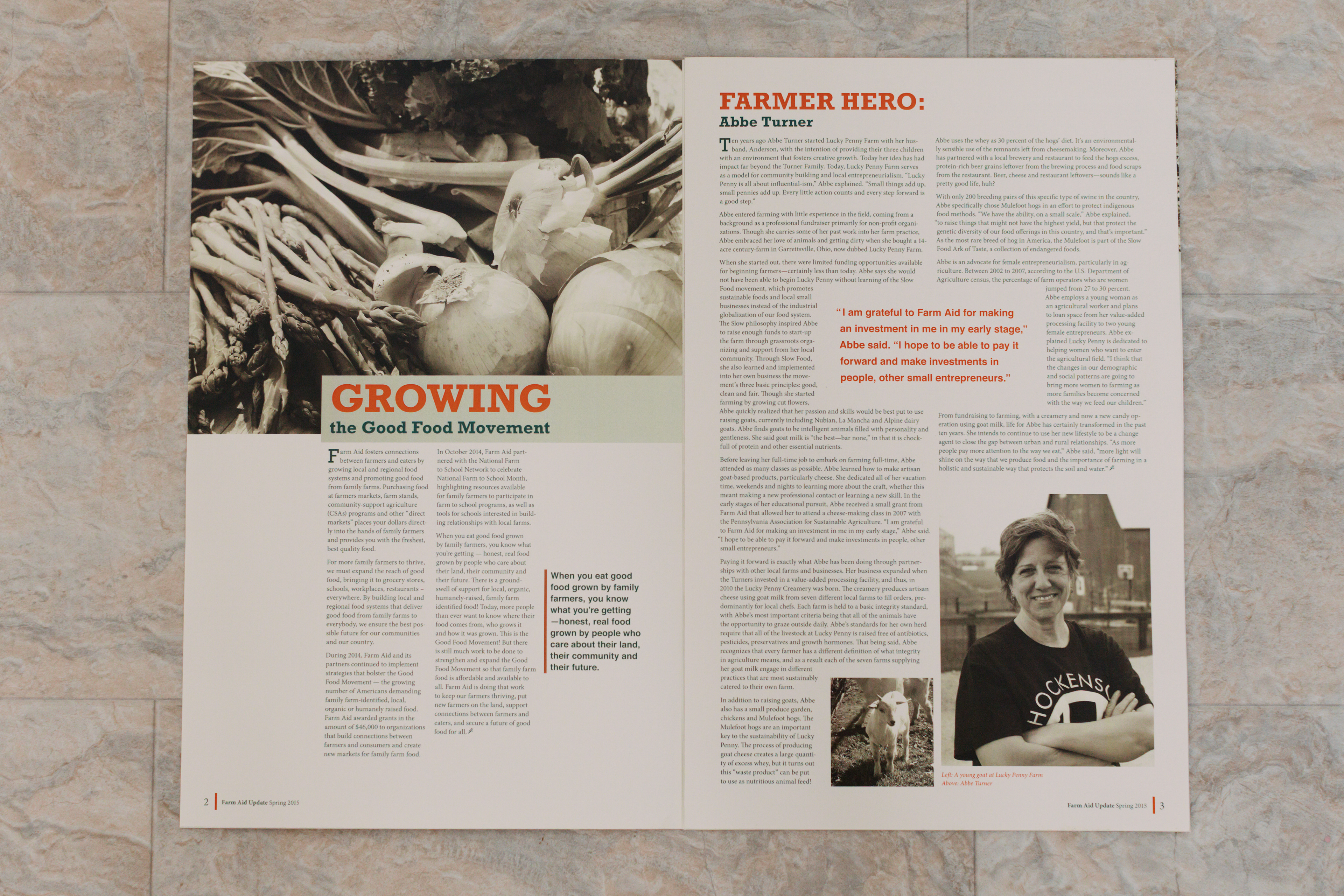
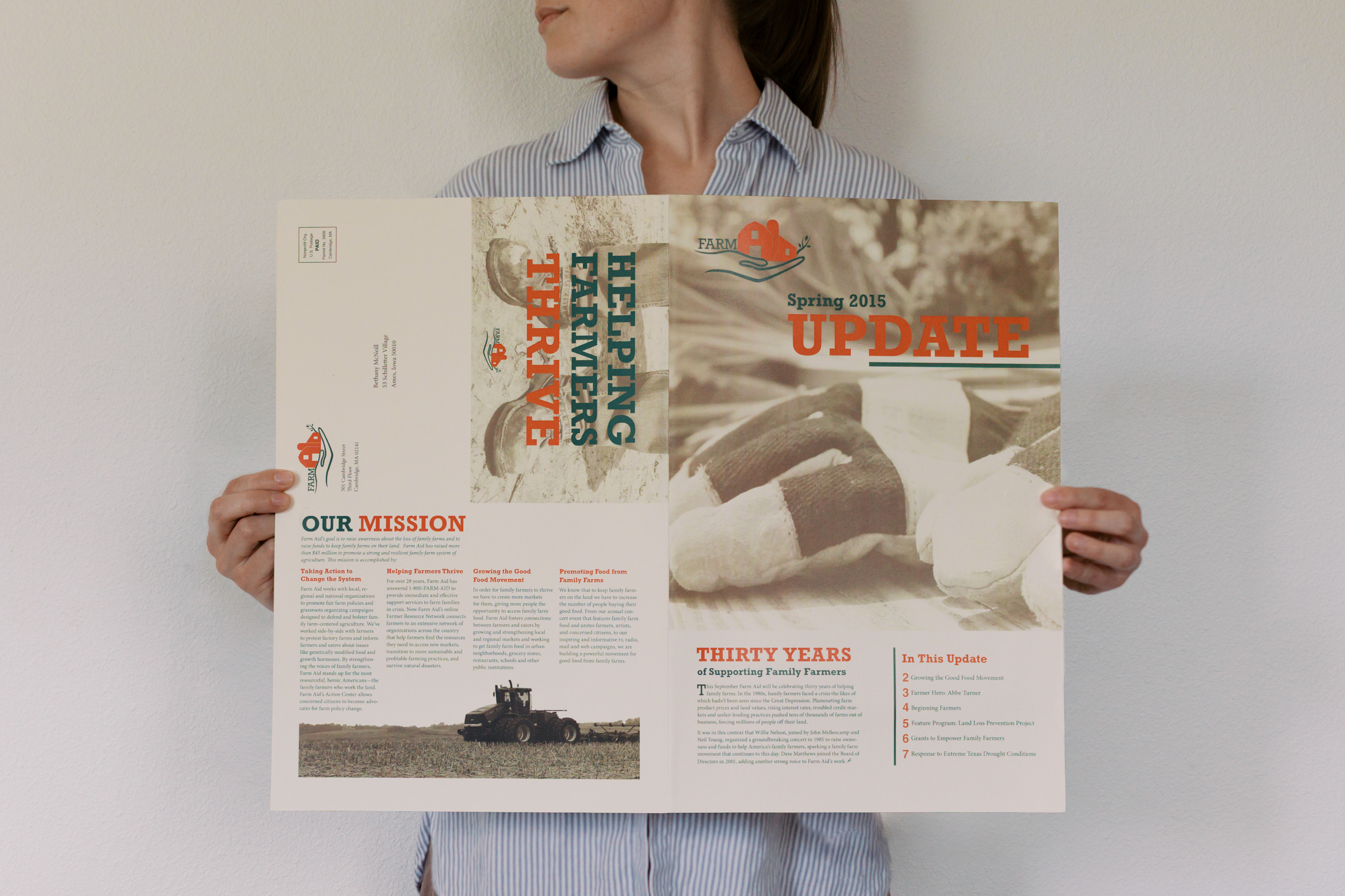
The challenge was to create an 8-page newsletter that balanced high-density information with rigorous production and postal constraints.
Production Constraints: A strict 2-color palette (Black + 1 PMS color) meant every visual asset—from logos to photos—had to be dual-purpose.
Physical Constraints: The layout had to accommodate a "double-fold" method for postal efficiency, requiring a modular design that functioned both folded and flat.
The User Pain Point: Existing non-profit materials often suffered from "bloated" or unorganized content. I needed to ensure the "helping hand" mission was clear at a glance.
2. Research & Discovery
Brand Audit: After I researched Farm Aid’s mission, I decided to redesign redesign the existing logo. The original logo relied on literal imagery (a tractor and flag) which felt cluttered; my redesign moved toward a conceptual 'helping hand' to prioritize the emotional mission of the non-profit.
Iterative Sketching: I began with hand-drawn sketches, experimenting with 2-column and 4-column grid structures to see how the layout would respond to physical fold lines.
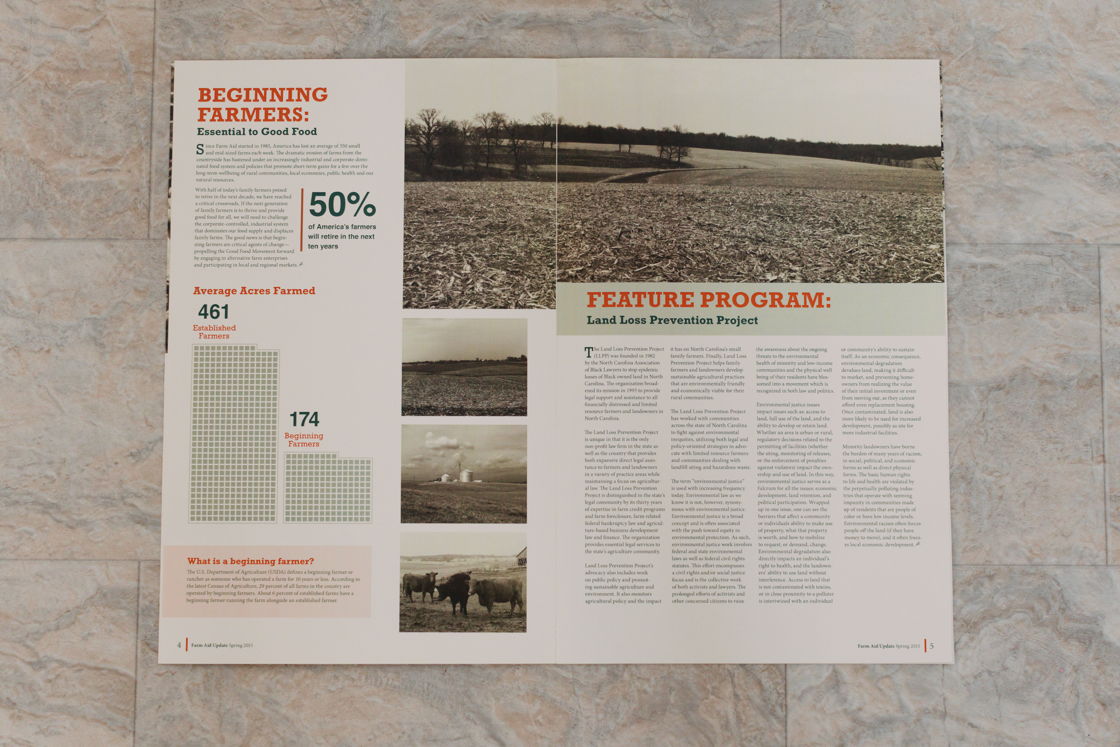
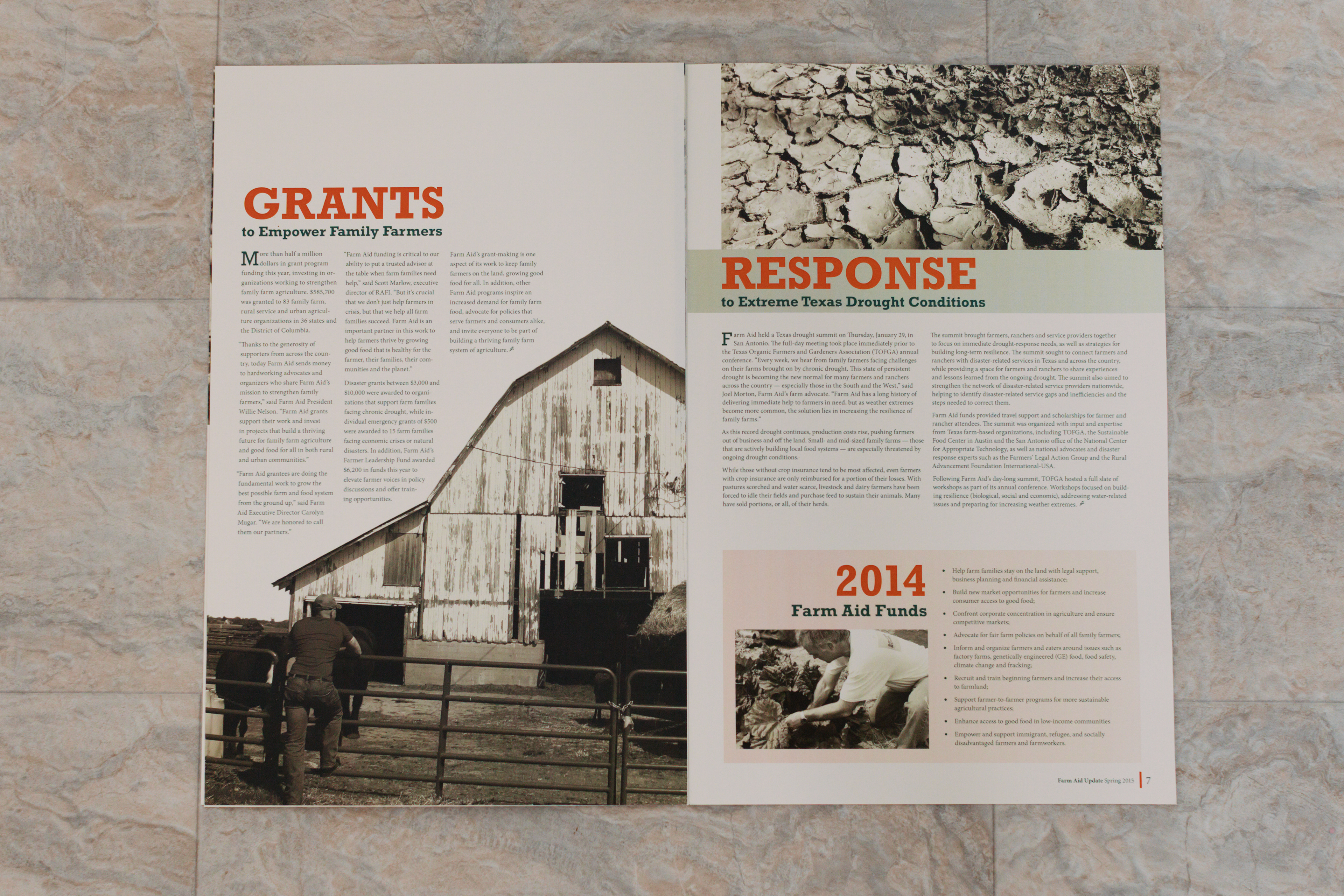
Content Strategy: I acted as researcher and editor, distilling large datasets into intentional articles to reduce decision fatigue for the reader.
Farm Aid logo before
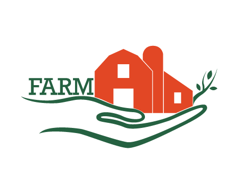
Farm Aid logo
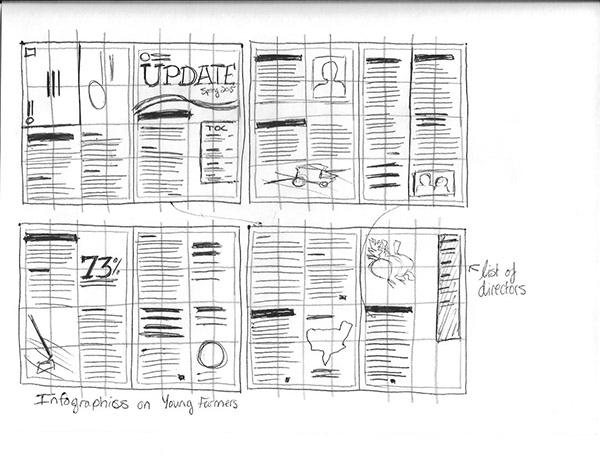
Paper sketches
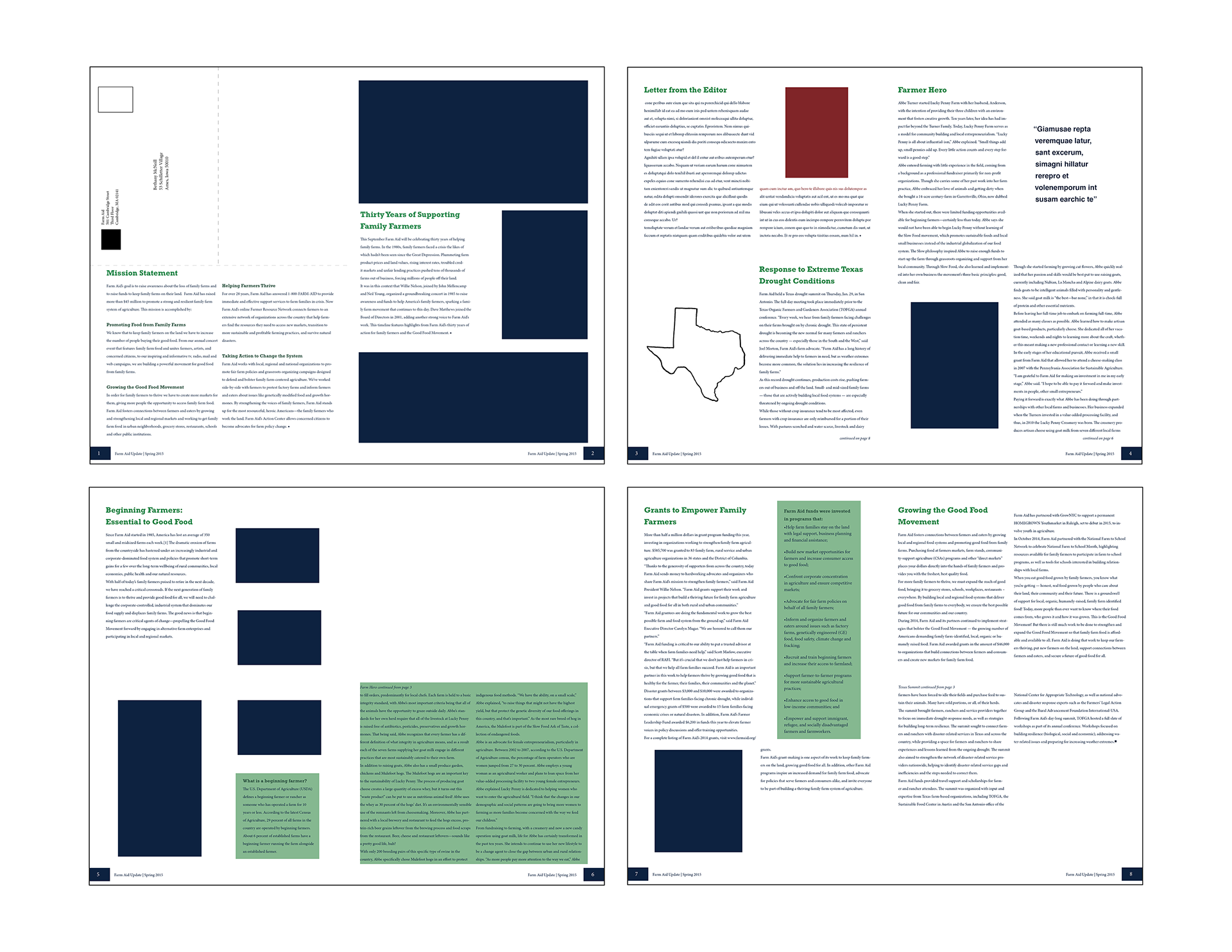
Initial InDesign wireframes
3. Design Strategy: Functional Color & Accessibility
With color as a major technical constraint, I chose a palette that served three masters: Brand Identity, Photographic Depth, and Typography Accessibility.
The Palette: I selected Orange and Green.
Accessibility: These colors provided high contrast for reading typography and lended to the "earthy" feel of the brand.
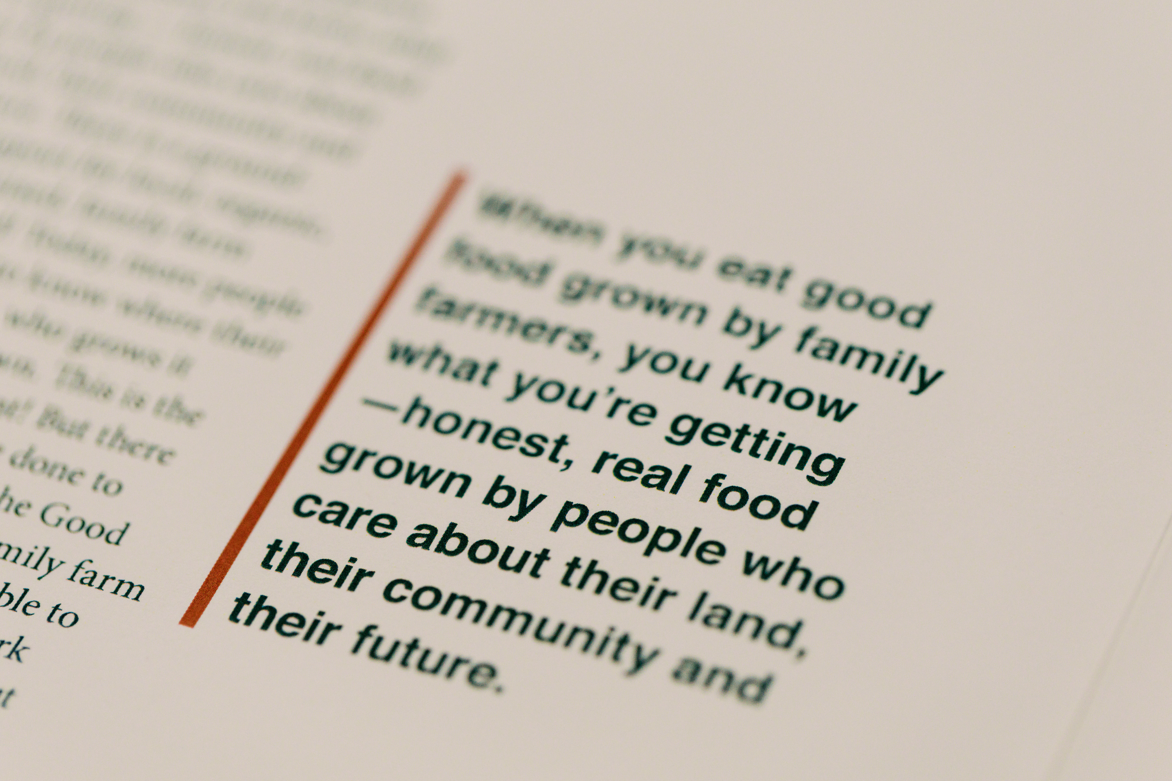
Typeface Selection: Rockwell (a slab serif) felt rustic like an old-time newsletter, which lended a grounded feeling. Minion Pro served as a classic, trustworthy typeface for the body copy.
Asset Management: When mixed in duotone photos, they created warm, sepia-toned images that added a human, "documentary" feel.
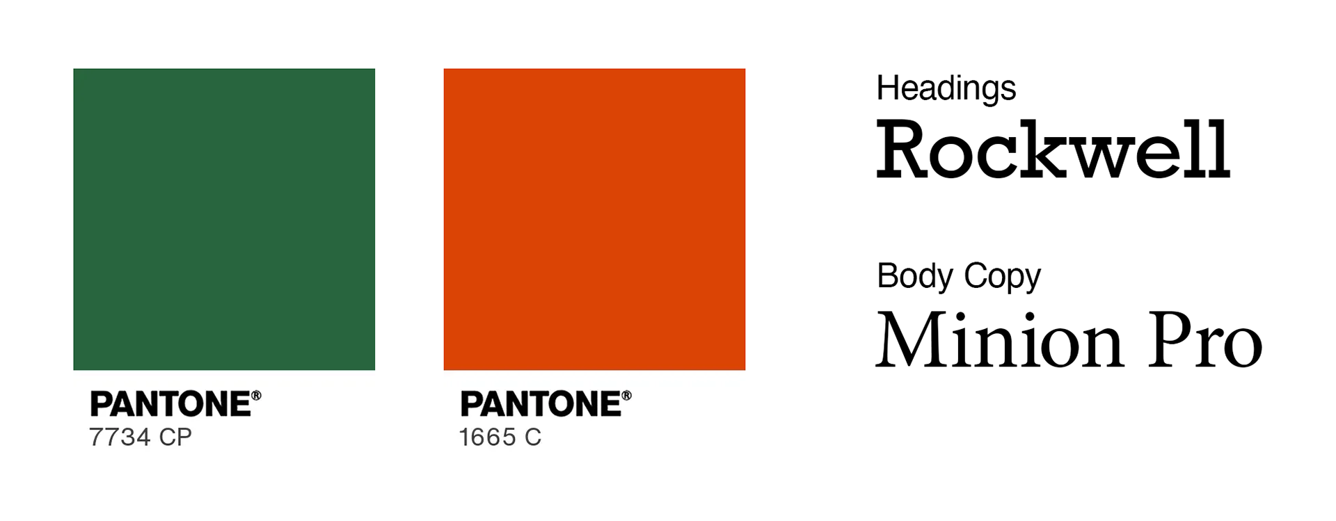
Color and typeface selections
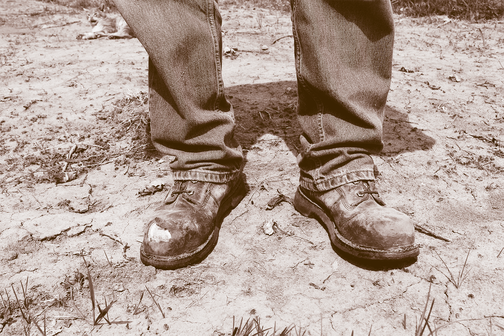
Duotone images created from a combination of the two Pantone colors.
4. Prototyping & The "Craft" of UX
Design isn't just about pixels; it’s about how a user interacts with a physical or digital "substrate."
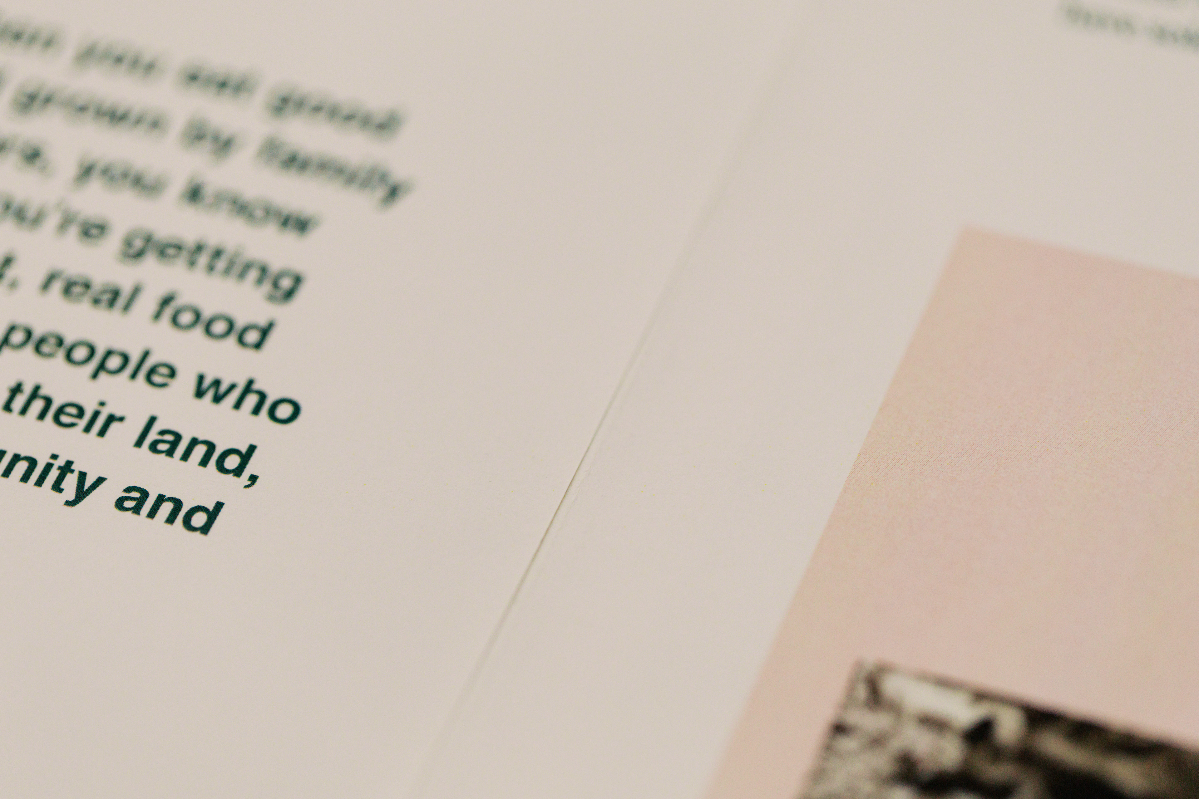
Material Research: I bypassed standard paper for a textured, off-white, letter-weight stock.
The Mental Model: I picked this specifically to mimic the tactile feel of a newspaper, signaling "information and news" to the user while elevating the brand through the paper's refined quality.
High-Fidelity Assembly: I hand-assembled the 17x22 sheets to test the physical interaction of the folds, ensuring margins and line art remained consistent across all 8 panels.
Hand-cut assembled pages
Pantone green for accessible reading
5. Execution & The Pivot (Self-Critique)
A year after completion, I iterated on the project for my senior portfolio, focusing on Data Visualization.
The Friction: My original "clever" design used corn cobs to represent acres farmed, but the sizing was ambiguous.
The Iteration: I replaced the cobs with a proportional grid graph where each square correlated to a specific number.
The Result: Information was no longer just decorative; it was intuitive and understandable at a glance.
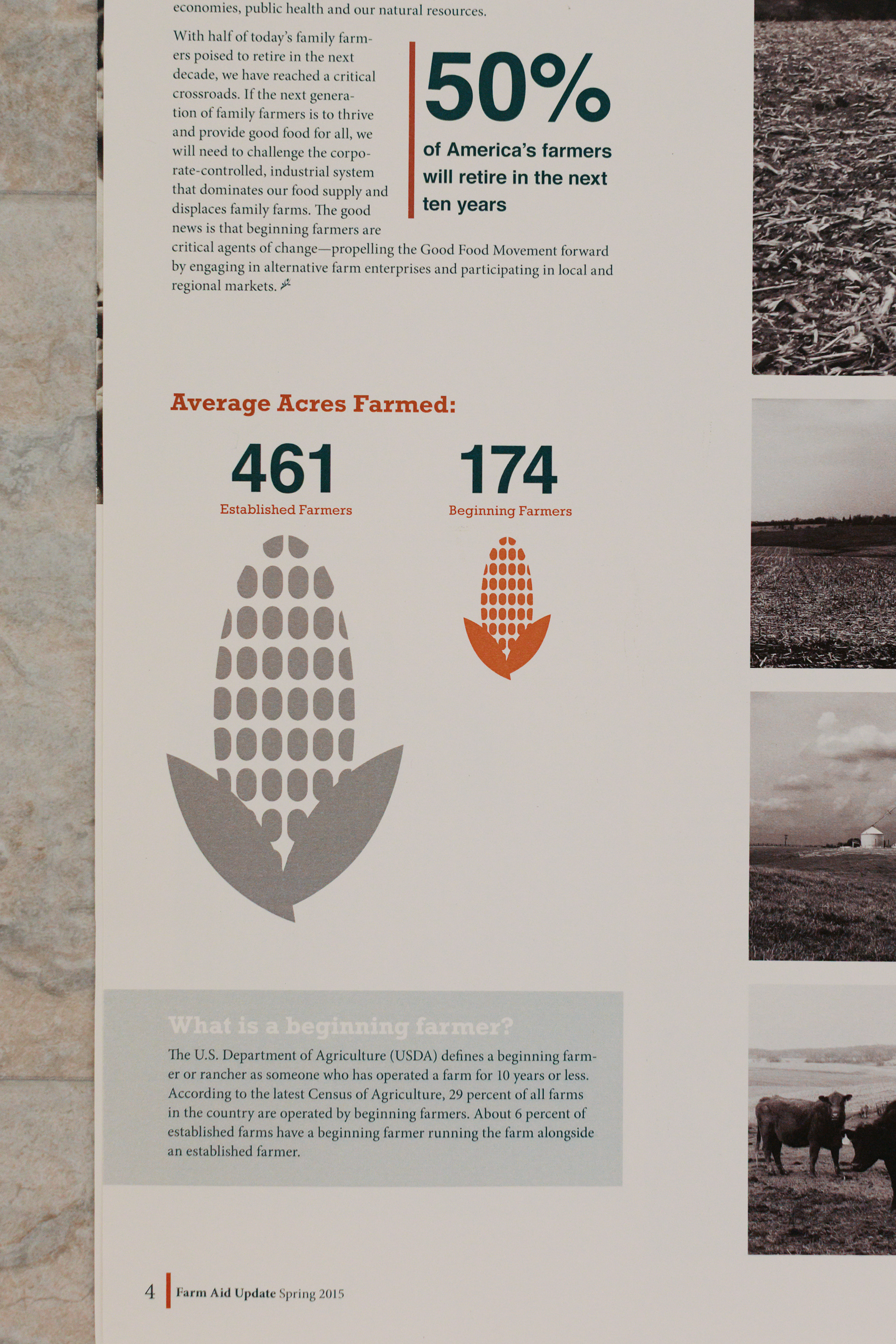
Before: Corn info graphic
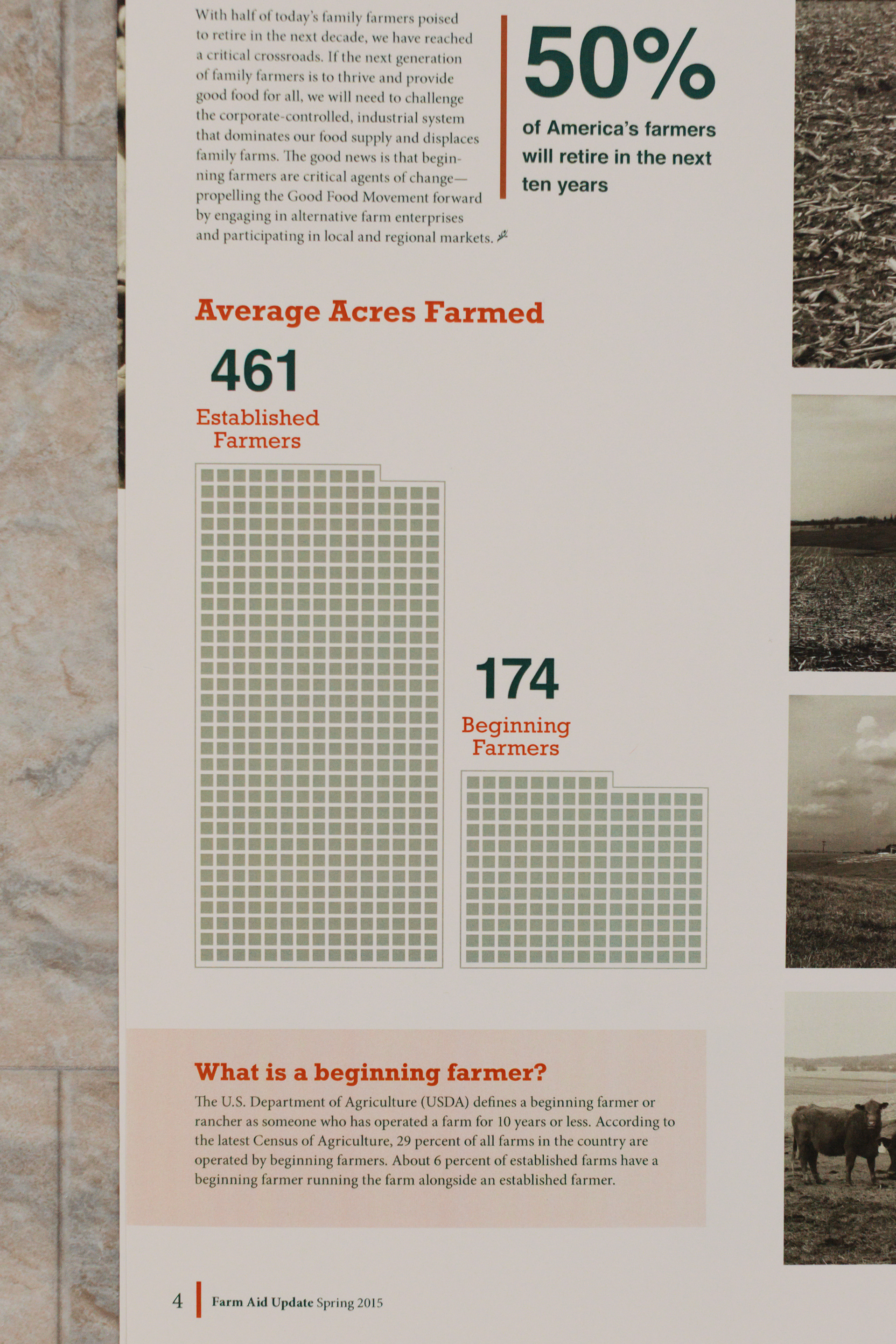
After: By moving from decorative icons to a proportional grid, I reduced the time it takes for a user to process complex agricultural data by ensuring a 1:1 correlation between visual units and numerical values
6. The Result: A Unified Ecosystem
This project was an early masterclass in Information Architecture. It taught me that whether I am working on a printing press or in Figma, the priority is always the same: distilling complexity into clarity.
Scalability: The system was designed to handle high-density data across multiple panels.
Visual Consistency: Maintained 100% brand integrity across 8 pages of diverse content.
Visual Consistency: Maintained 100% brand integrity across 8 pages of diverse content.